
Creating Reports
Overview
This section will focus on how to create and customize reports in Analytics.
Creating Your First Report
Once you have selected an explore, you will see the explore screen, as shown below:
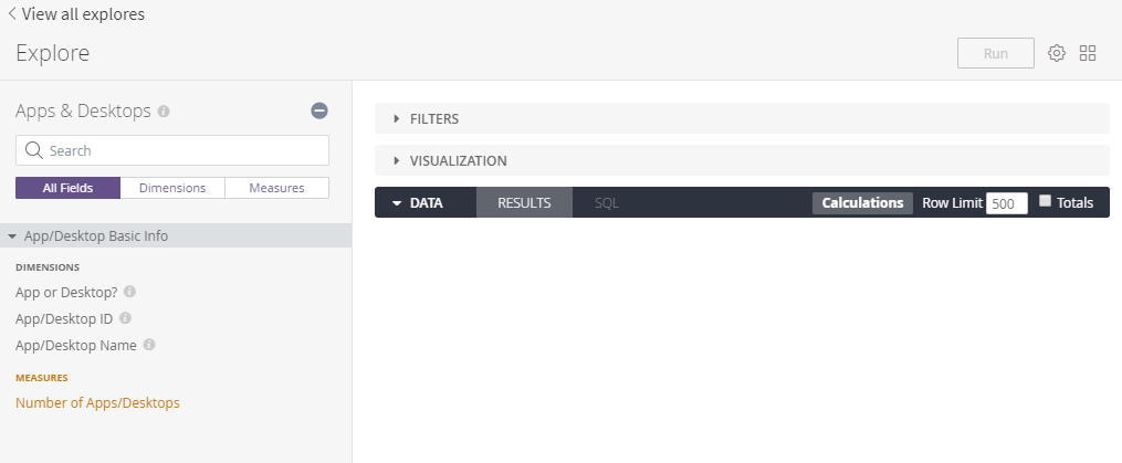
From the explore page, you can create any report related to the explore you chose using the data points provided on the left hand side.
Start by selecting the bits of information you want to build you report on from those available on the left hand side. As an example, let's take a look at how many apps and desktops we have in the system.
To do this, click on App or Desktop? and Number of Apps/Desktops. As you click each field on the left hand side, you will see them added as columns in a table under the DATA section on the right-hand side.
You can see a brief description of what each field means by hovering over the ![]() icon next to the field in the list.
icon next to the field in the list.
Click the Run button in the top right of the screen and the table that you generated will be populated with the data from the database.
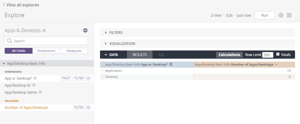
There we have it, your first report! This shows that we have 10 apps and 6 desktops configured in our instance of AppsAnywhere.
This report is presented as a temporary table that is only visible here until we make a change or leave the page. Next we'll look at creating a different type of report and adding it to a dashboard, so it's always available.
Creating a Visualization
Now you know how easy it is to pull data from AppsAnywhere Analytics, the next thing you will want to do is to create a visual representation of that data.
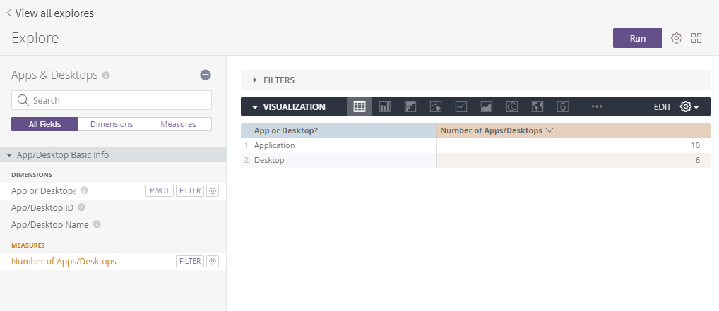
Continuing from where we left off with the number of apps and desktops, click to expand the VISUALIZATION section of the explore view.
The first and simplest visualization you will see here is the Table visualization which, unsurprisingly, looks exactly like the table we had earlier. The difference is it's now a visualization we can add to a dashboard (more on that in a minute).
You will also see a whole range of other visualizations available to you along the dark grey bar, feel free to flick through these and try them out. Not all of them will be available, it depends on the type of data you have selected, for example, we can't represent this data as a map, so that option will be unavailable.
As our data contains numerical values that represent a subset of an overall number, a pie chart would be a great option, so let's select the Pie visualization.
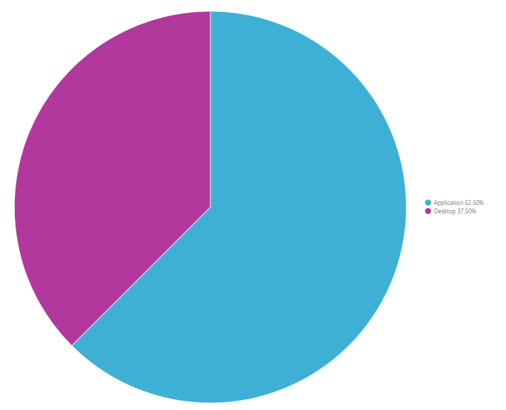
There we go! You now know how to very quickly and easily make a whole range of visualizations based on the data you have selected in an explore.
If deep pink and light blue aren't your colors of choice, click on Edit, next to the cog dropdown on the right-hand side of the visualization bar where you can find a load of options to customize how your visualization looks, such as the colors used, what type of legend or labels to use, what to call each section and loads more. These options are specific to the type of visualization so make sure to check them out for each type, to get a feel for what options are available to you.

Next, we'll take a look at what you can do with that visualization, how you can share it with others and how you can save it to see it at any time.