
Creating Tiles and Dashboards
Overview
Dashboards are the main focal point of AppsAnywhere Analytics. Dashboards bring together different visualizations (or tiles) into a single place, so you can present and share related bits of information quickly and easily and keep coming back to that information again and again. In this article, we'll explain everything you need to know to create your own dashboards.
Getting started
Dashboards are all about presenting the data sets and visualizations you created using explores, so before you start creating dashboards, you'll need to understand the concept of explores and how you can use them to find the data you need. If you aren't yet familiar with explores, start by reading the Using Explores article and then come back here.
Once you are familiar with exploring data and creating custom visualizations, the next step is to save these visualizations as tiles on your own dashboards.
You will also need to have been assigned the Analytics Explorer role in AppsAnywhere to be able to explore data and create your own dashboards. Ask someone with the global admin role in AppsAnywhere if you do not have the required permissions
Saving to a Dashboard
Saving a visualization on a dashboard allows you, or other users, to come back to it in future. Visualizations are saved as tiles on a dashboard, allowing you to "save" that visualization to view in real time at a later date.
You can either create dashboards for your own use, or to share with colleagues within your organization. The different types of dashboards are described in more detail in the Using Dashboards article.
To save a visualization to a dashboard using AppsAnywhere Analytics:
Create your desired visualization, as described in the Using Explores article
Click the cog in the top right hand side of the UI
Select the Save to Dashboard... option
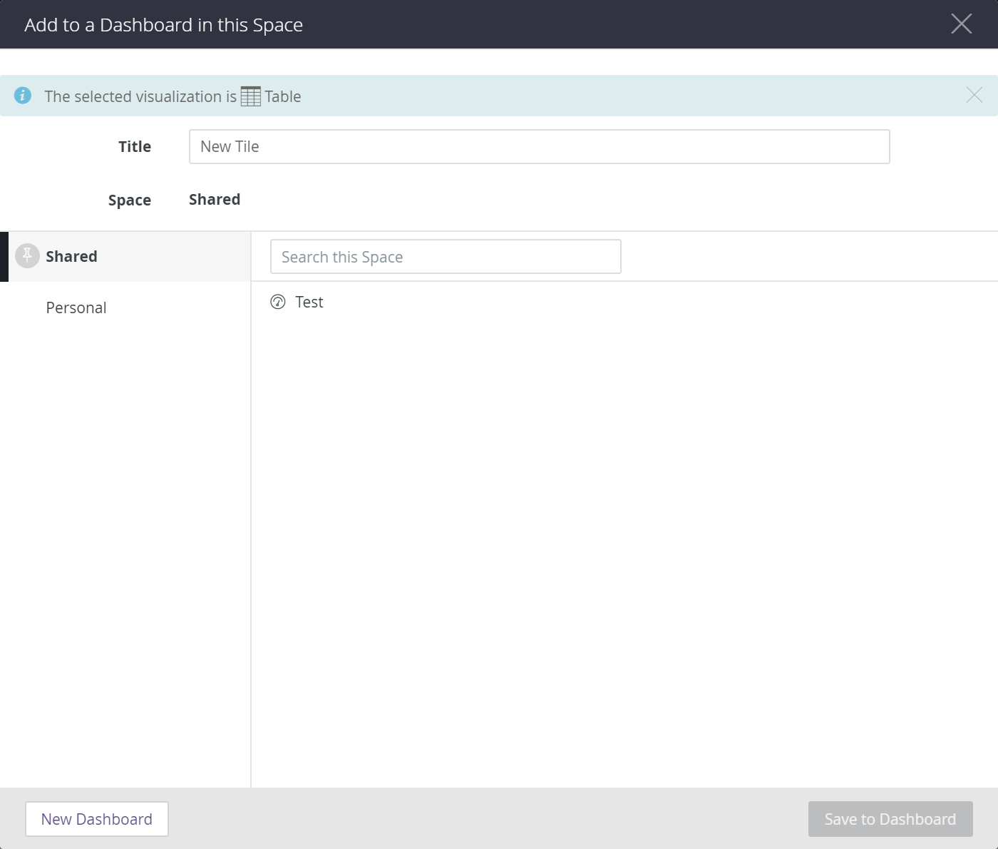
You will then be presented with the Add to Dashboard screen, as shown below:
From here, you have one of two options;
Create a new dashboard and save your visualzation to that
Add your visualization to an existing dashboard
Each of these options is described in the following sections
Saving to a new Dashboard
If you want to save your visualization to a new dashboard, you first have to decide where you want that dashboard to go, i.e. who you want to be able to access it.
You can either create the new dashboard in an area only you access (My Dashboards), or an area where other people in your organization can also access (Shared Dashboards). By default you will be creating new dashboards in an area everyone who has access to analytics in your organization can see. If you prefer to be the only person who can see your dashboard, you can select Personal in the left hand column.
Once that you have chosen the area where you would like to save the dashboard, follow the steps below to create it:
Click the New Dashboard button
When presented with the Enter the new Dashboard name dialog, enter a name which encompasses the theme of the visualizations you will add to this dashboard
Click OK (Once created, the dashboard will automatically selected as the location to save your visualization)
In the Title box, enter a name that describes your visualization (e.g. Number of Launches or Best Apps)
Click Save to Dashboard
Congratulations! You just created your first dashboard which now contains a single tile; your first visualization!
To view the dashboard you have just created, go back to the dashboards page (as described in the Using Dashboards article)
If you saved the dashboard in the shared space, the you can open it by locating it in the Shared Dashboards section on the sidebar, alternatively if you saved the dashboard in your personal space, you can open it by locating it in the My Dashboards section on the sidebar.
Saving to an existing Dashboard
If you have already created a dashboard and just wasnt to add your new visualzation as an additional tile on your existing dashboard then this is even simpler:
Select the relevant space where your dashboard is located (if it's in the shared space, you should already see it, if it's in the personal space, click on Personal)
Select the dashboard in the list
Add a name for the tile, as before
Click Save to Dashboard
Editing the Layout of a Dashboard
Once you have created a dashboard and saved one or more tiles to it, you will probably want to change how the tiles are laid out, how big they all are and where they are positioned etc.
To change how your dashboard looks:
First navigate to the dashboard you want to edit
Click the Edit button in the top right corner
If you can not see the edit button, it is probably because you do not have the required role, or you are trying to edit a Built-in Dashboard. Only users with the Analytics Explorer role can create and edit dashboards
Once you have clicked the Edit button, you will see that you are in edit mode and you can make various changes to the dashboard, these include:
Resizing each tile by dragging the bottom right corner
Move each tile by dragging the top left corner
Edit the tile using the top right action buttons
You can also edit the contents of any tile (the visualization itself, or the data it shows) by clicking the little Edit (pencil) icon for that tile.
This process is fairly intuitive, just drag and drop the tiles around and re-size them as required. Once you are finished, click Done Editing
It is not possible to edit built-in dashbaords. If you want to make changes to a built-in dashboard, you would need to re-create the visualizations and add them to your own dashboard. You can see how the built-in dashboards are created in the Creating The Built-in Dashboards article.